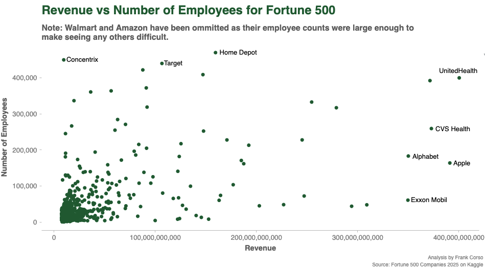
I am working on a new guide for creating scatterplots with the Python Seaborn package and thought I’d use a Fortune 500 dataset for the examples. I was curious to see how revenue compares against the number of employees.
I discovered that Walmart and Amazon have 5x as many employees as the next companies, so I couldn’t even see most of the companies on the chart with them in it. I didn’t realize just how large their workforce is.
After removing them, I noticed a couple of interesting points:
- CVS is grouped closer to the healthcare and tech companies than the retail companies
- Exxon Mobil has extremely high revenue per employee, even higher than a lot of tech companies
Of course, revenue only reflects raw sales, and we’d have to look at profit and EBITA to really see where the differences are. But, it was still fun to explore with.