
As someone who works with data every day, something I do a lot is create dashboards for both internal and external use. I use several different tools for this, such as Tableau and Quarto, but one that I use quite a bit is Streamlit. In this post, I’ll walk you through creating your first basic Streamlit dashboard.
What is Streamlit?
Streamlit is a Python library that allows you to easily create web apps without writing any of the frontend code. While it can be used for many types of projects, I primarily use it for dashboards and interactive visualizations.
Streamlit comes with many types of components and widgets that you can simply call and use. And, it works with Pandas and other data libraries out of the box. It also allows you to add interactive components, such as dropdowns, sliders, color pickers, and more, that the user can use to make changes to your dashboard.
Examples of Streamlit Dashboards
There are many examples of Streamlit apps available in the Streamlit Gallery and Streamlit Community Cloud.
Some of the ones that I think are most useful when getting started are:
- https://goodreads.streamlit.app - Goodreads analysis that changes based on input
- https://ssg-dataset.streamlit.app - Example app with a sidebar for navigating to different pages containing different charts
- https://demo-seattle-weather.streamlit.app - Simple weather dashboard
For each of these, there is a GitHub link in the top-right corner that you can click to see the code used to create the Streamlit app.
Creating Your First Streamlit Dashboard
To get started, you need to install Streamlit:
pip install streamlit
From there, you can create a new Python file. To run the file as you build it, you can use:
streamlit run my_file.py
The first thing we will want to do (after importing Streamlit) is to set the page config. This allows us to set the browser title and other options. For now, we will just set the title. For all available options, see the set_page_config documentation.
import streamlit as st

st.set_page_config(
    page_title="My First Dashboard",
)
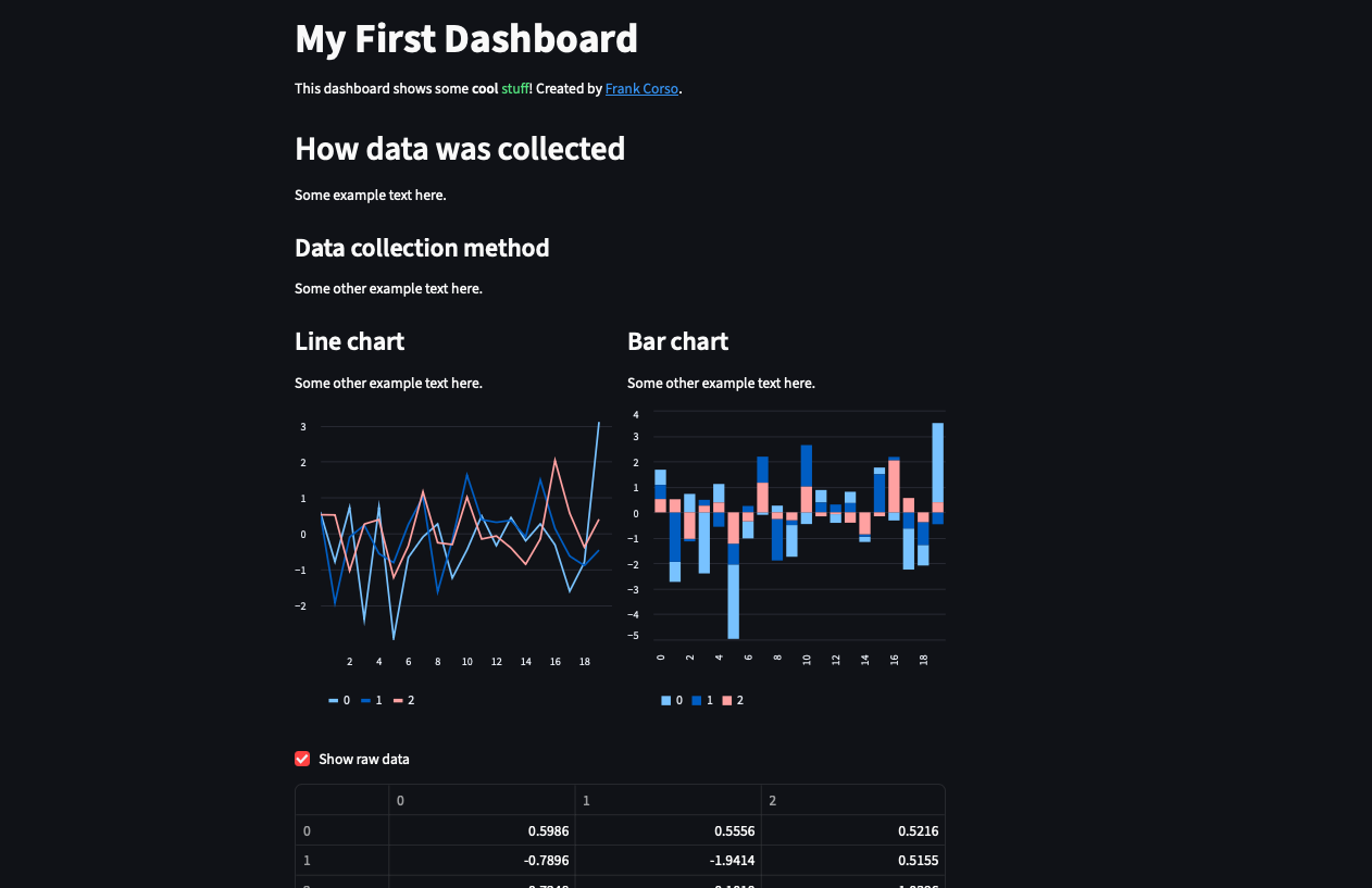
From there, I often start off with a main heading with some text explaining the dashboard or the analysis. To do this in Streamlit, we can use the st.title() function and st.markdown() function.
st.title("My First Dashboard")
st.markdown("This dashboard shows some **cool** :green[stuff]! Created by [Frank Corso](https://frankcorso.me).")
If we want to, we can add more headings and sections using st.header() and st.subheader().
st.header("How data was collected")
st.markdown("Some example text here.")
st.subheader("Data collection method")
st.markdown("Some other example text here.")
Now that we have some sections, we can add a couple of columns and some charts. First, we can load in any data as we normally would. Then, use st.columns() to create a grid of columns.
Using the with statement, we can create a new column for each chart.
import pandas as pd
import numpy as np

# Create random example data.
data = pd.DataFrame(np.random.randn(20, 3))

column1, column2 = st.columns(2)

with column1:
    st.subheader("Line chart")
    st.markdown("Some other example text here.")
    st.line_chart(data)

with column2:
    st.subheader("Bar chart")
    st.markdown("Some other example text here.")
    st.bar_chart(data)
Now, let’s add a checkbox that reveals a table of raw data to demonstrate an interactive component.
if st.checkbox("Show raw data"):
    st.table(data)
Now, if the user clicks on the checkbox, they will see the raw data.
If you test this out and click the checkbox, you will notice the tables and data change with each click. This is because the data is being re-generated every time the checkbox is clicked, and our data is random.
To keep the exact random data, we can use the st.cache_data decorator to cache the data instead.
@st.cache_data
def load_data():
    return pd.DataFrame(np.random.randn(20, 3))

data = load_data()
This isn’t completely necessary here, but it’s a useful thing to be aware of. I tend to use this more with long-running functions, when getting data from APIs, or when downloading large datasets.
If you haven’t already, run the file with streamlit run my_file.py and you should see your dashboard! It will look something like this:
Next Steps
Now that you have created your first Streamlit dashboard with some basic components, you can move on to adding more types of components. You can check out the Streamlit API Reference for more built-in types or you can check out the Streamlit Components documentation to see what 3rd-party components are available.
Once you have a dashboard, you can deploy public dashboards for free using either Streamlit Cloud or Posit Connect Cloud. You can also deploy public or private dashboards using your own server or in Snowflake.