Published on
I scraped 8 weeks of Apple Podcasts chart data to measure how much rankings shift week to week. Some categories, like News and Comedy, barely change.
Frank Corso
Solving data challenges for growing companies
I have 2–3 spots available for companies who have data challenges they need solved.
I create various data stories as well as occasionally write articles on data visualization, data engineering, and data science.
Published on
I scraped 8 weeks of Apple Podcasts chart data to measure how much rankings shift week to week. Some categories, like News and Comedy, barely change.
Published on
This analysis examines the median age of U.S. Congress members vs. the U.S. and state populations. Find out if Congress truly represents the age demographics of the nation and individual states.
Published on
I was recently working with Apple Podcasts charts data and was curious how much the charts change week-to-week. I am already scraping some Apple Podcasts charts already for a separate project, so I decided to look at the Science category for the US charts.
It turns out that the top few podcasts are fairly stable, but even just in the top 20, the podcasts change quite a bit.
Published on
Need to add search functionality to your Python app? This guide walks you through everything you need to get started with OpenSearch, from setting up your first index to writing fuzzy and multi-field queries.
Published on
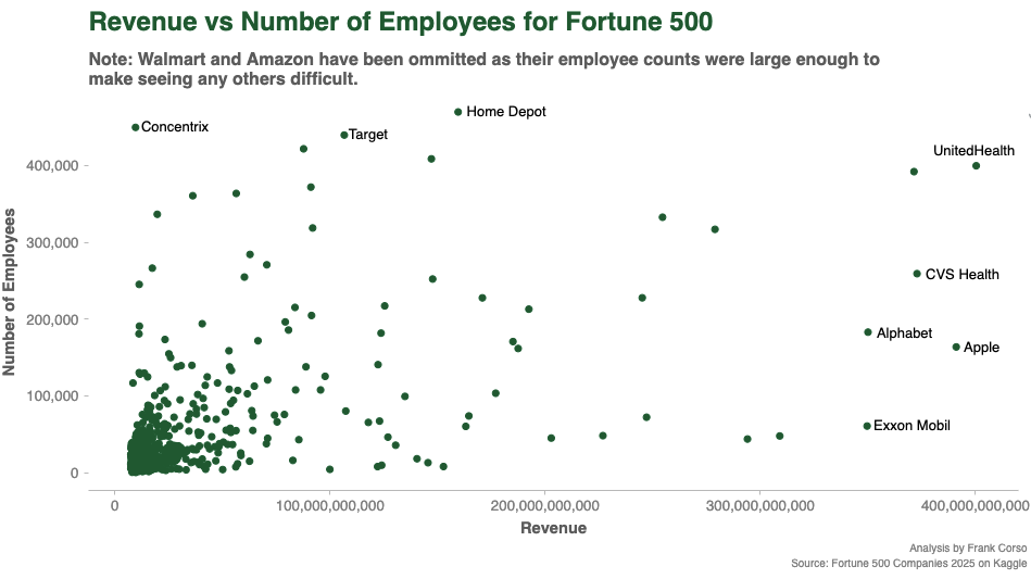
I am working on a new guide for creating scatterplots with the Python Seaborn package and thought I’d use a Fortune 500 dataset for the examples. I was curious to see how revenue compares against the number of employees.
I discovered that Walmart and Amazon have 5x as many employees as the next companies, so I couldn’t even see most of the companies on the chart with them in it. I didn’t realize just how large their workforce is.
After removing them, I noticed a couple of interesting points:
Of course, revenue only reflects raw sales, and we’d have to look at profit and EBITA to really see where the differences are. But, it was still fun to explore with.
Published on
Scatterplots are a great way to visualize relationships between different dimensions. Learn how to create them in Python using Seaborn.
Published on
Maintaining datasets on Kaggle? This tutorial walks you through automating dataset updates using the Kaggle Python API. You’ll learn how to authenticate, format the required data metadata file, and upload new versions programmatically—perfect for integrating into your data pipelines.
Published on
Sometimes, you need to find the largest tables in a MySQL database. There are a few ways to do this, but I think this is the easiest.
Run this query in MySQL to find the largest tables by size in GB:
SELECT table_schema AS "DB-name",
table_name,(data_length + index_length)/1024/1024/1024 AS "TableSizeinGB"
FROM information_schema.tables
WHERE table_schema='YOUR_SCHEMA' -- You can omit if you only have 1 schema in the DB
ORDER BY TableSizeinGB DESC;
Published on
Learn how to get started with Streamlit by building a simple, interactive dashboard from scratch.
Published on
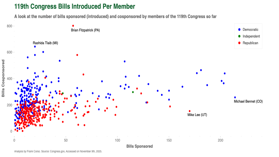
I was curious to know how many bills a U.S. Congress member introduces or co-sponsors. It turns out that most don’t introduce new bills often.
Many have only introduced a handful since the start of this term.

Published on
Do you need to extract content or links from a webpage programmatically? You can do so in Python using Requests and Beautiful Soup!
Published on
Heatmaps are a great way to visualize the frequency or ranges of a multi-dimensional dataset. Learn how to create them in Python using Seaborn.
Published on
Using AWS Athena? Learn how to use Python to perform queries to get data from Athena.
Published on
Working with text data for analysis or machine learning? You probably will need to remove stop words. Learn how in this article!
Published on
Looking to visualize connections between different categorical values? Learn how to create a chord diagram!
Published on
Explore the capabilities of AWS Athena, a versatile serverless query engine that empowers you to effortlessly query unstructured, semi-structured, and structured data stored in Amazon S3 using SQL.
Published on
Assessing your classification model’s performance is a critical step. This article explores the key classification metrics such as accuracy, precision, recall, f1 score, and specificity.
Published on
Looking to visualize the data from your Pandas dataframe? Seaborn is a great data visualization library. Learn how it works by creating your first chart!
Published on
One of my favorite MySQL functions that I wished more people knew about is GROUP_CONCAT. This lets you create an aggregated list of values in your queries. Read on to learn how to use it.
Published on
Need to work with CSV files in Python? Learn how to open, read, and write to CSV files!
Published on
With several longer movies being released in the last few years, I wanted to see if movies have gotten longer.